제주도의 증가하는 관광객들로 인해, 주민들이 통행량을 예측할 수 있다면 실생활(출퇴근 등)에서 사용할 수 있을 것이다.
1. Data Info Check
(1) 라이브러리 import
import os
import json
import numpy as np
from pandas.api.types import CategoricalDtype
import plotly.express as px
from sklearn.ensemble import RandomForestRegressor
from sklearn.model_selection import train_test_split
from sklearn.metrics import mean_absolute_percentage_error
from sklearn.preprocessing import StandardScaler
import folium
import shap

shap.initjs()
이번엔 통행량을 표로만 확인하기에 한눈에 들어오지 않아서 지도에 직접 찍어서 확인해보기위해
folium 라이브러리를 사용했다.
(2) Data Check
df.dtypes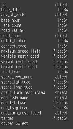
df.head(10)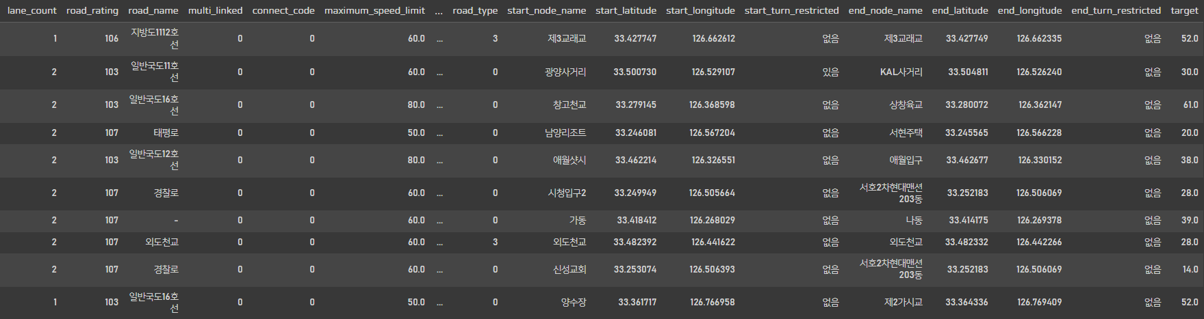
데이터를 살펴보니 위경도, 유턴제한 유무, 최고속도제한 등등이 데이터에 포함되어있고 target값으로는 평균속도가 들어있다.
map_data = df.groupby(['start_latitude', 'start_longitude', 'end_latitude', 'end_longitude'])['target'].mean().reset_index().sort_values('target',ascending=False)
map_data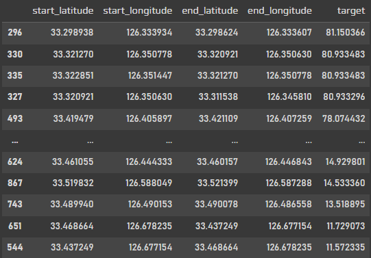
위경도를 숫자로 보고 아~ 이게 어디구나 하는 사람은 거의 없을것이다,,
그래서 위경도를 기준으로 지도에 직접 찍어서 확인해 보려고 한다.
map = folium.Map(location=[33.308412, 126.488029], zoom_start=10)
folium.Marker([33.418412, 126.268029], popup='Start', icon=folium.Icon(color='blue')).add_to(map)
folium.Marker([33.414175, 126.269378], popup='End', icon=folium.Icon(color='blue')).add_to(map)
def to_line(x):
    if x['target'] > 80: target_color='green'
    elif x['target'] > 50: target_color='blue'
    elif x['target'] > 30: target_color='orange'
    else: target_color='red'
    folium.PolyLine(locations=[[x['start_latitude'], x['start_longitude']], [x['end_latitude'], x['end_longitude']]], tooltip='Polyline',color=target_color).add_to(map)
map_data.apply(to_line, axis=1)
map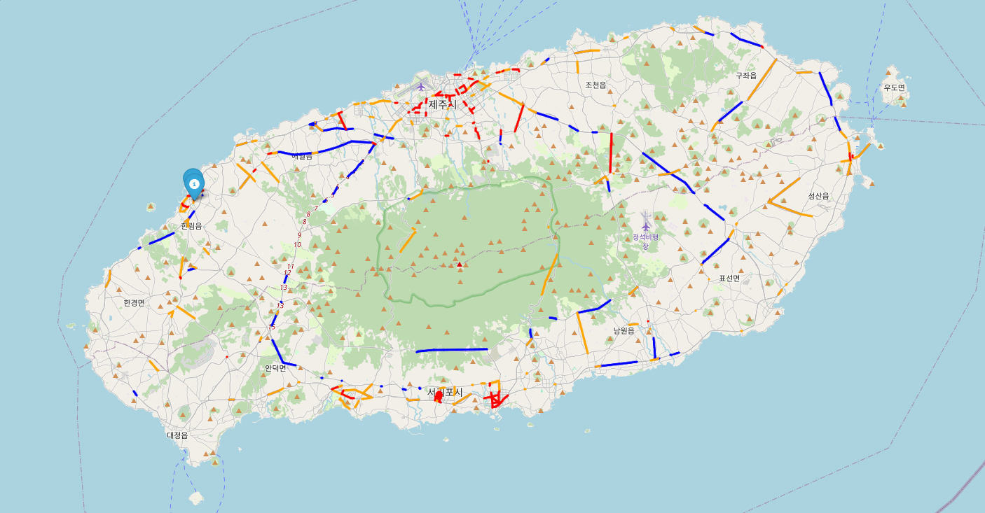
직접 지도에 찍어보니 한눈에 확인이 가능해서 좋다.
데이터 자체가 통행량을 나타내는 데이터가 아니라 특정 구간에서 통행하는 차량의 평균속도를 나타내는 데이터 였다.
그래서 80km이상 달리면 막히지 않고 잘 달린다 라고 생각해서
평균 속도로 구간을 나누어서 색깔을 표시해주었다.
가장 달리는 구간은 그린색으로 4개정도의 데이터밖에 없어서 육안으로 확인하기 어려웠지만
50km이상 구간은 블루로 눈에 잘 띄었다.
또한, 공항이 있는 제주시나, 관광지가 많은 서귀포시는 30km이하인 빨간 구간이 눈에 띄게 많이 보인다.
2. Data Readiness Check
df.columns.tolist()
num_columns = df.select_dtypes(include=np.number).columns.tolist()
col_columns = df.select_dtypes(include=object).columns.tolist()
유사한 정보를 가진 데이터 컬럼을 확인하고 제거하기 위해 리스트형으로 변경
num_columns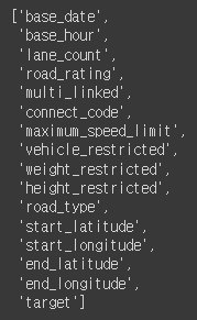
col_columns
df[['id', 'day_of_week', 'road_name', 'start_node_name', 'end_node_name']]
데이터를 확인 해보았을때
id값은 사용할 수 없어 삭제.
day_of_week 데이터도 날짜 데이터와 겹쳐서 삭제.
road_name은 null값이 많아서 삭제.
start_node_name과 end_node_name도 위,경도 데이터와 겹쳐서 삭제해주었다.
3. Featrue Engineering
df['base_date'] = pd.to_datetime(df['base_date'], format='%Y%m%d') # 20220401 -> 2022-04-01
df['year'] = df['base_date'].dt.year
df['month'] = df['base_date'].dt.month
df['dayofweek'] = df['base_date'].dt.dayofweek # day_of_week 월화수목금토일
df = df.drop(['id', 'base_date', 'day_of_week', 'road_name', 'start_node_name', 'end_node_name'], axis=1)
df
먼저 object 형으로 되어있는 날짜형식을 datatime으로 바꾸어줬다.
df['start_turn_restricted'] = df['start_turn_restricted'].astype('category').cat.codes
df['end_turn_restricted'] = df['end_turn_restricted'].astype('category').cat.codes
df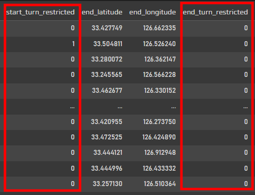
원래 있음, 없음으로 구분되어있던 회전가능구간을 회귀모델에 적용하기 위해서 Boolean타입으로 변경!
0이 없음, 1이 있음으로 구분해주었다.
df.isnull().sum()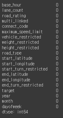
결측값이 없는 것도 한번 확인.
df.describe().T.round(2)
데이터 describe를 확인해보면 확실히 최고속도제한 부분이 구간이 딱딱 나뉘어져있다.
근데 회귀모델을 사용하기에 범위가 다양해서 스케일한번 주고 모델링을 해보겠다.
y = df.pop('target')
X = df
pop은 끝에있는 값부터 하나씩 추출해서 사용하는 함수.
target값이 없을때까지 모델을 돌려보자
(1) RandomForest
X_train, X_test, y_train, y_test = train_test_split(X, y, test_size=0.2, random_state=0)

sc = StandardScaler()
sc.fit(X_train)

X_train_std = sc.transform(X_train)
X_test_std  = sc.transform(X_test)

rf_clf = RandomForestRegressor(n_estimators=100, max_depth=5, n_jobs=-1, verbose=1, random_state=0)

rf_clf.fit(X_train_std, y_train)

predicted_train = rf_clf.predict(X_train_std)
predicted_test = rf_clf.predict(X_test_std)

print(f"{mean_absolute_percentage_error(predicted_train, y_train)}")
print(f"{mean_absolute_percentage_error(predicted_test, y_test)}")
먼저 트리류 모델인 랜덤포레스트를 돌렸을때는 에러값이 약 20%정도 나온다.
max_depth를 주지 않고 돌리다가 무료코랩계정이 터지는 바람에 max_depth=5로 주고 진행했다.
explainer = shap.Explainer(rf_clf)
shap_values = explainer(X_test_std)
shap.summary_plot(shap_values, X_test, plot_type='bar') # permutation importance
shapvalue를 사용해서 모델링에 영향을 끼친 피쳐들을 확인해보았다.
19개의 피쳐중 8개의 피쳐만 사용이 되었다.
shap.plots.beeswarm(shap_values)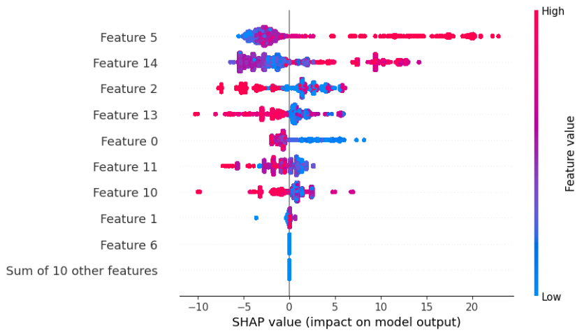
요 shapvalue는 영향을 미치는 피쳐들이 어디에 분포가 되었는지 확인할 수 있는 그래프이다.
feature6 이하로는 영향을 미치지 않는것이 확인되어쏘
최고속도제한피쳐의경우는 높을수록 분포가 많이 넓은 편이다.
(2) XGB
import xgboost

X_train, X_test, y_train, y_test = train_test_split(X, y, test_size=0.2, random_state=0)

xgb_model = xgboost.XGBRegressor(n_estimators=100, max_depth=5)
xgb_model.fit(X_train, y_train)

xgb_predicted_train = xgb_model.predict(X_train)
xgb_predicted_test = xgb_model.predict(X_test)

print(f"{mean_absolute_percentage_error(xgb_predicted_train, y_train)}")
print(f"{mean_absolute_percentage_error(xgb_predicted_test, y_test)}")
랜덤포레스트 결과가 썩 좋지 못해서 XGBoost모델도 추가!
랜덤포레스트 모델보다 에러값이 거의 반으로 줄은것을 확인 할 수 있다.
explainer = shap.Explainer(xgb_model)
shap_values = explainer(X_test)
shap.summary_plot(shap_values, X_test, plot_type='bar')
XGBoost도 shap value로 피쳐를 확인해보았을때
랜덤포레스트보다 더 다양하게 피쳐를 사용하고 있는 것을 확인 할 수 있다.
아무래도 제주도가 여행지의 느낌이 강하다보니 월, 요일 같은 날짜 데이터도 중요하다고 생각한다.
shap.plots.beeswarm(shap_values)
랜덤포레스트보다 구분이 좀더 명확하게 눈에 띈다.
4. Modeling
(1) RandomForest
X_train, X_test, y_train, y_test = train_test_split(X[['maximum_speed_limit','end_latitude','start_latitude','road_rating','start_longitude','base_hour','end_longitude','lane_count']], y, test_size=0.2, random_state=0)

sc = StandardScaler()
sc.fit(X_train)

X_train_std = sc.transform(X_train)
X_test_std  = sc.transform(X_test)

X_test['pred'] = rf_clf.predict(X_test_std)
X_test['real'] = y_test
X_test['differ'] = abs(X_test['pred'] - X_test['real']) / X_test['real'] #APE
X_test
먼저 랜덤포레스트로 모델링. 차이를 수치로 나타내줬다.
import seaborn as sns

sns.distplot(X_test[['pred']])
sns.distplot(X_test[['real']])
주황색이 실제값, 파란색이 예측값
위에서 랜덤포레스트 모델을 사용했을 때 8개의 피쳐만 가지고 모델링을 했었기 때문에
특정 노드에 값이 많이 쏠려있는것이 확인 되었다.
sns.distplot(X_test[['differ']])
differ값도 그래프로 확인.
0에 가까운 값이 다수이나 오른쪽으로 꼬리가 매우 길어지는 그래프의 양상을 보이고 있습니다.
(2) XGBoost
X_train, X_test, y_train, y_test = train_test_split(X, y, test_size=0.2, random_state=0)

X_test['pred'] = xgb_model.predict(X_test)
X_test['real'] = y_test
X_test['differ'] = abs(X_test['pred'] - X_test['real']) / X_test['real']
X_test
다음으로는 랜덤포레스트보다 에러값이 낮았던 XGBoost도 그래프로 확인해보겠습니다.
sns.distplot(X_test[['pred']])
sns.distplot(X_test[['real']])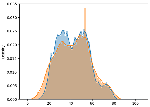
주황색이 실제값, 파랑색이 예측값
확실히 랜덤포레스트보다 훨씬 좋은 값으로 확인 됩니다.
sns.distplot(X_test[['differ']])
XGBoost도 오른쪽 꼬리가 길어지는 차이값을 가지고 있지만,
randomforest는 약 50까지도 갔는데 XGBoost는 약 35정도까지만 가는 것으로 확인 됩니다.
(3) Application
test_df['base_date'] = pd.to_datetime(test_df['base_date'], format='%Y%m%d')
test_df['year'] = test_df['base_date'].dt.year
test_df['month'] = test_df['base_date'].dt.month
test_df['dayofweek'] = test_df['base_date'].dt.dayofweek
test_df = test_df.drop(['id', 'base_date', 'day_of_week', 'road_name', 'start_node_name', 'end_node_name'], axis=1)
test_df['start_turn_restricted'] = test_df['start_turn_restricted'].astype('category').cat.codes
test_df['end_turn_restricted'] = test_df['end_turn_restricted'].astype('category').cat.codes
test_df
실제 예측값을 넣은 지도모양으로 앱을 한번 출력해보겠습니다!
(3)-1. RandomForest
X = test_df[['maximum_speed_limit','end_latitude','start_latitude','road_rating','start_longitude','base_hour','end_longitude','lane_count']]
X_std = sc.transform(X)

X['pred'] = rf_clf.predict(X_std)
map = folium.Map(location=[33.308412, 126.488029], zoom_start=10)
#folium.Marker([33.418412, 126.268029], popup='Start', icon=folium.Icon(color='blue')).add_to(map)
#folium.Marker([33.414175, 126.269378], popup='End', icon=folium.Icon(color='blue')).add_to(map)
def to_line(x):
if x['pred'] > 80: target_color='green'
elif x['pred'] > 50: target_color='blue'
elif x['pred'] > 20: target_color='orange'
else: target_color='red'
folium.PolyLine(locations=[[x['start_latitude'], x['start_longitude']], [x['end_latitude'], x['end_longitude']]], tooltip='Polyline',color=target_color).add_to(map)
map_data[map_data['base_hour']==6].apply(to_line, axis=1)
map
(3)-2. XGBoost
X = test_df
X['pred'] = xgb_model.predict(X)map_data = X.groupby(['start_latitude', 'start_longitude', 'end_latitude', 'end_longitude', 'maximum_speed_limit', 'base_hour'])['pred'].mean().reset_index()
map = folium.Map(location=[33.308412, 126.488029], zoom_start=10)
#folium.Marker([33.418412, 126.268029], popup='Start', icon=folium.Icon(color='blue')).add_to(map)
#folium.Marker([33.414175, 126.269378], popup='End', icon=folium.Icon(color='blue')).add_to(map)
def to_line(x):
    if x['pred'] > 80: target_color='green'
    elif x['pred'] > 50: target_color='blue'
    elif x['pred'] > 20: target_color='orange'
    else: target_color='red'
    folium.PolyLine(locations=[[x['start_latitude'], x['start_longitude']], [x['end_latitude'], x['end_longitude']]], tooltip='Polyline',color=target_color).add_to(map)
map_data[map_data['base_hour']==6].apply(to_line, axis=1)
map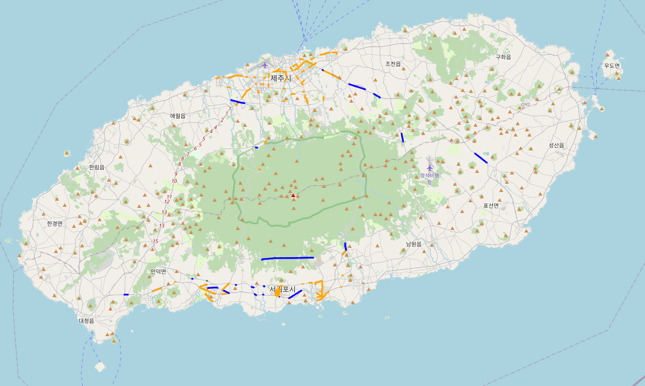
좀더 세세하게 조건을 주거나 뜯어보면 차이가 있겠지만
사람들이 아직 많이 다니지 않을 시간인 새벽 6시 기준으로는 둘의 통행량 데이터가 크게 차이나보이진 않습니다.
map = folium.Map(location=[33.308412, 126.488029], zoom_start=10)
#folium.Marker([33.418412, 126.268029], popup='Start', icon=folium.Icon(color='blue')).add_to(map)
#folium.Marker([33.414175, 126.269378], popup='End', icon=folium.Icon(color='blue')).add_to(map)
def to_line(x):
    if x['pred'] > 80: target_color='green'
    elif x['pred'] > 50: target_color='blue'
    elif x['pred'] > 20: target_color='orange'
    else: target_color='red'
    folium.PolyLine(locations=[[x['start_latitude'], x['start_longitude']], [x['end_latitude'], x['end_longitude']]], tooltip='Polyline',color=target_color).add_to(map)
map_data[map_data['base_hour']==15].apply(to_line, axis=1)
map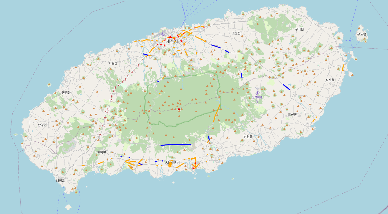
중간에 base_hour를 교체하면 시간대별로 통행량을 알 수 있습니다.
'개발새발 > 데이터분석' 카테고리의 다른 글
| [Python] 가스 공급량 분석 및 예측 모델(시계열분석) (0) | 2024.02.13 |
|---|---|
| [Python] 공조기기 전력 사용 상태 분석(json파일 처리) (1) | 2024.02.07 |
| [Python] 신용카드 이상거래 탐지 모델(Undersampling, Oversampling) (2) | 2024.02.02 |
| [Python] E-commerce 행동 데이터 분석(RFM기반, Kmeans) (1) | 2024.01.31 |
| [Python] 어떤 동물이 빨리 입양될까?(Logistic Regression, scikit-learn, tensorflow) (3) | 2024.01.29 |